
Reframed
Overview
When Reframed came to me, they were called Dynamic Insights Partners — a name and a brand their team was struggling to stand behind. A workplace and leadership consulting agency that fundamentally restructures how teams operate, they had outgrown a brand that never really fit them to begin with. Working alongside brand strategy consultant Carolyn Coyne, my job was to bring the new identity to life from the ground up. A full rebrand. New logo, new color palette, and a custom iconography system built to communicate everything from the simple and literal to the complex and intangible.
Let’s get into it—
✦ Skills
Logo Design, Brand Design, Iconography System, Color
✦ Collaborators
Carolyn Coyne, Brand Strategy Consultant
✦ Industry
B2B, Professional Services, Consulting
-
Work with a team who knew exactly what they wanted, and deliver something that exceeded even their expectations
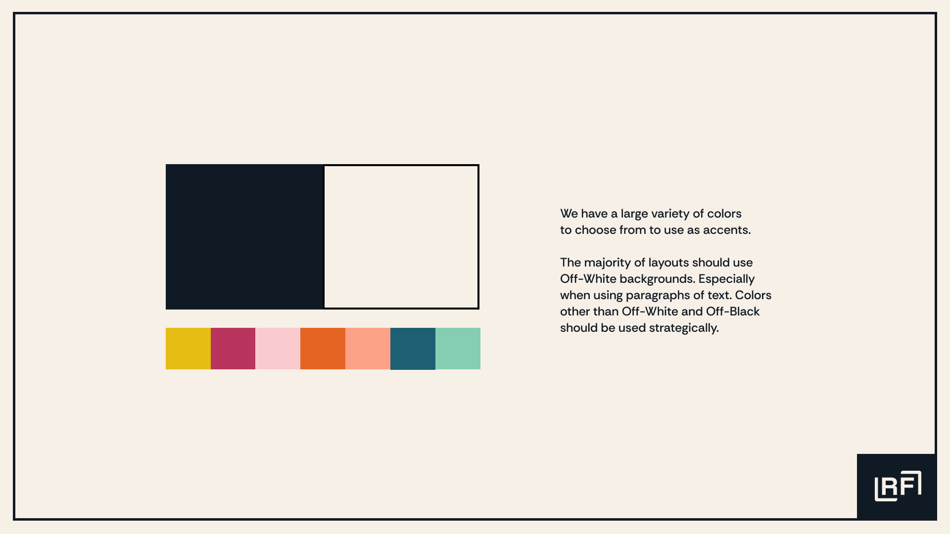
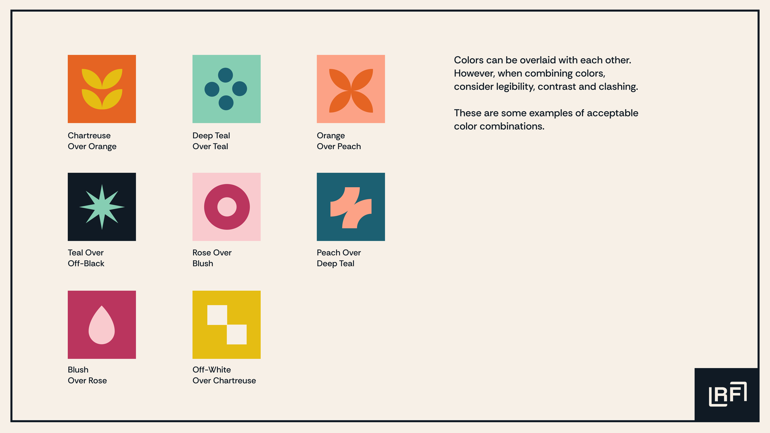
The old color palette left the team feeling limited, and so they wanted a breadth of color options, while still feeling cohesive.
This team needs to communicate complex, intangible insights that resist conventional illustration.
-
Build a color palette bold enough to inspire, flexible enough to grow — including a very specific request for chartreuse
Design a custom iconography system capable of expressing everything from the literal to the intangible
Translate the brand strategy research into a living, breathing visual identity

Their excitement for this work was palpable from day one. Reframed knew who they were — they just needed a brand that finally showed it. Together we built something that reflected their joy, their professionalism, and their work-in-progress mindset. Minimalist enough to feel intentional. Flexible enough to grow with them.
Icon Families
I created a custom library of icon shapes using six different shape families: Frames, Droplets, Dots, Leaves, Sharps, and Arches. Each family starts with a single basic shape and builds upon itself using repetition, scale, rotation and overlapping. Each family evokes a different feeling, and can represent a limitless number of concepts from simple and literal, to complex and intangible.
The Droplet Family

The Frame Family

The Arch Family

The Sharp Family

The Dot Family

The Leaf Family

Of everything in this project, the iconography system is what I'm most proud of. Six families, infinite combinations, and a visual logic robust enough to express the full range of what Reframed does — from the concrete to the completely intangible. Their excitement when they saw it come together was the best possible confirmation that I nailed the brief.
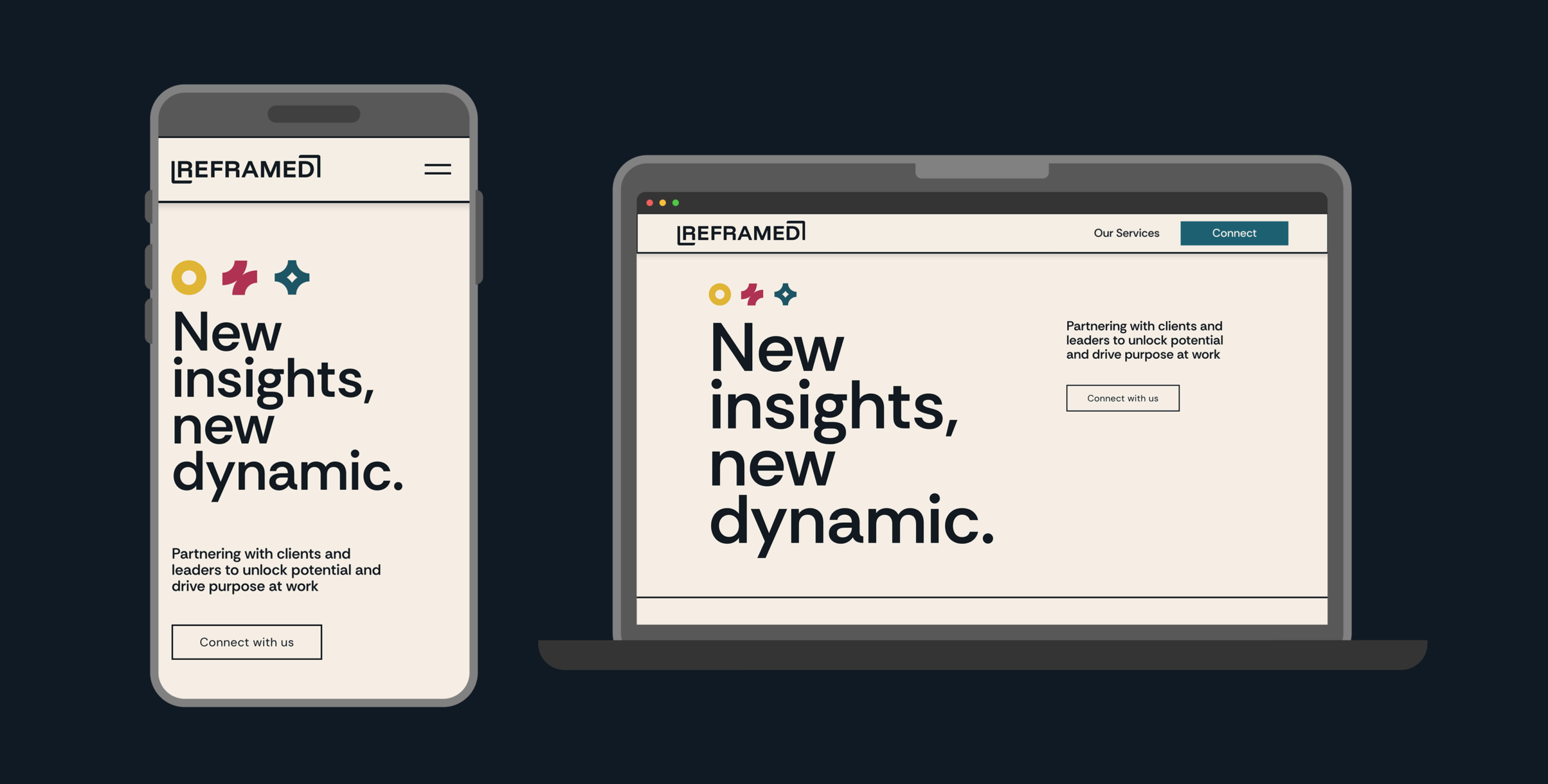
I also designed Reframed's website, building a digital home that let the brand breathe and the icon system take center stage. The brand is theirs now — and watching it evolve in their hands is exactly what a good brand system should allow.