
Portalis AI
Overview
Portalis AI came to me early in their startup phase looking to add a professional face to their brand. They had a collection of distinctive characters and sophisticated technology backed by your favorite LLMs…but nothing else. The challenge was finding a visual language that could hold its own alongside the characters without competing with them, and stand out in an AI landscape that had already started to look identical.
Let’s get into it—
✦ Skills
Brand Design, Logo Design, Iconography, Typography
✦ Collaborators
J Todd Coleman, Founder
✦ Industry
Ai, Tech

-
The AI space is over saturated with many new apps popping up daily.
Portalis AI is brand new with a very small established audience, and could easily be lost in the sea of new AI solutions.
-
Complete a Design Brief with key stakeholders to establish goals.
Find areas of opportunity through a Competitive Analysis of the AI Brand landscape.
Explore a visual space that distinguishes itself from the tidal wave of new AI brands.
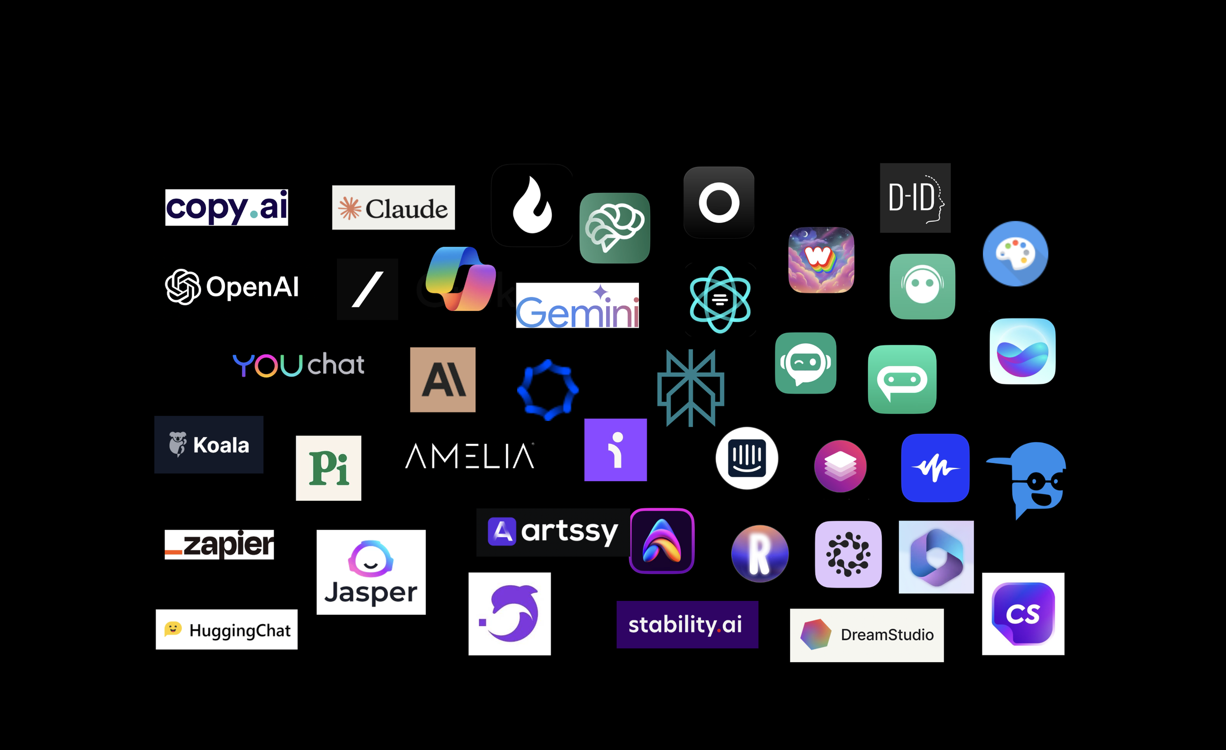
Before touching a pixel, I mapped the competitive landscape. The AI landscape was already saturated with the same visual vocabulary — purples and greens, atoms and weaving circle designs, a few rainbows, and an army of green robots.
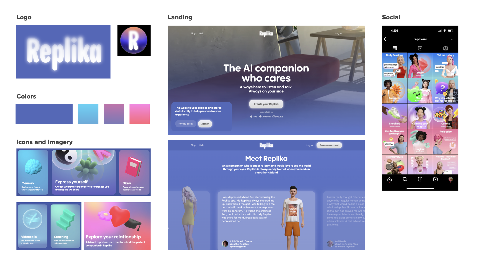
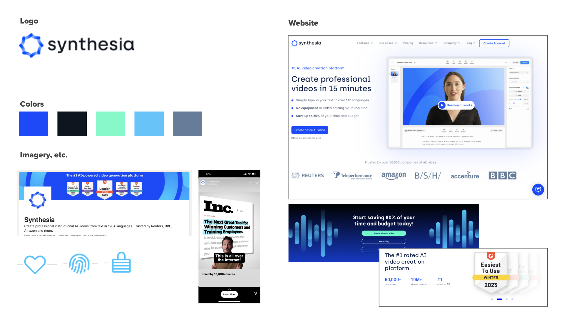
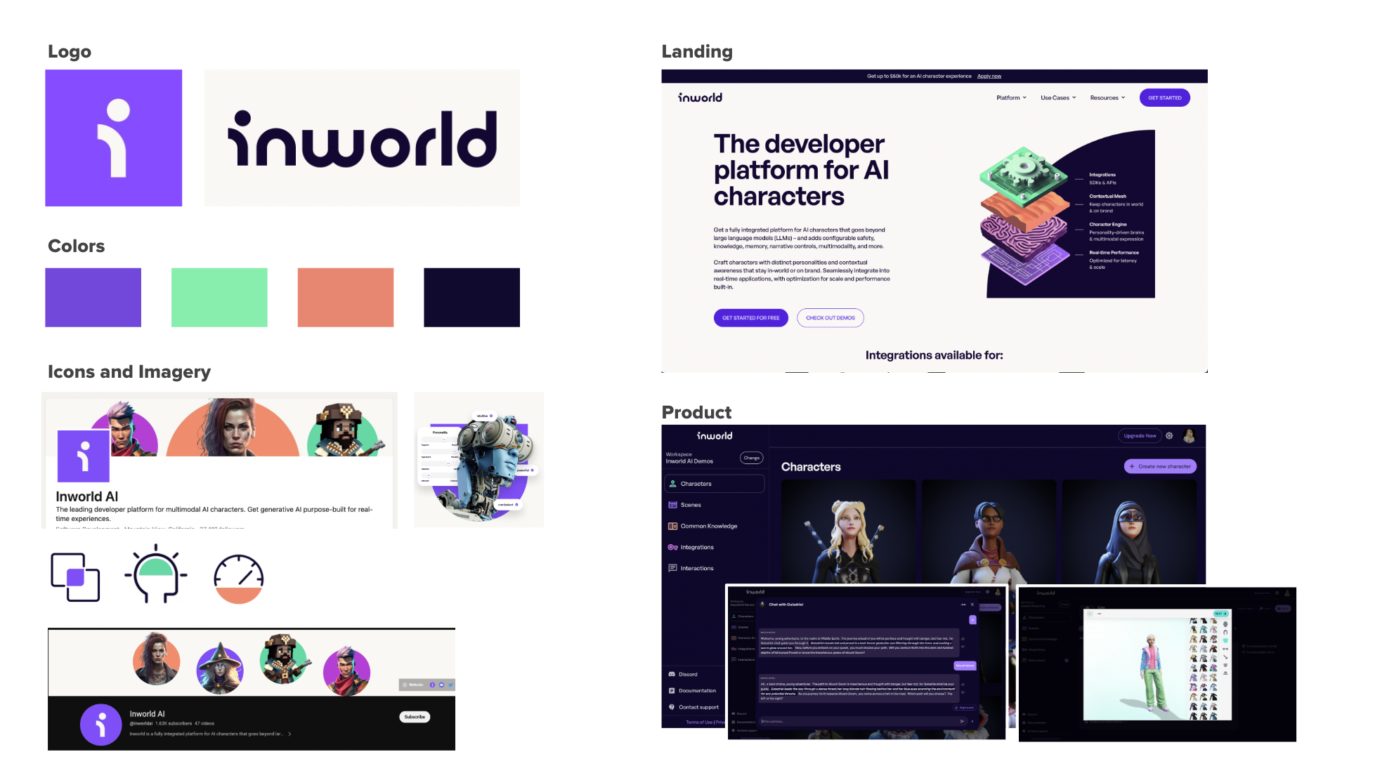
I asked the team who they found themselves up against most often, and took a closer look. I identified places for opportunity, and spaces where we absolutely did not want to go. Replika was borderline predatory. Synthesia was clinical. Inworld had a clean brand, but did not use their avatar artwork to the fullest potential.
The largest gaps? Warmth, personality, expressiveness, texture, organic shapes, maybe even primary colors. I then, in the same presentation, dove straight into preliminary moodboards based on these findings.
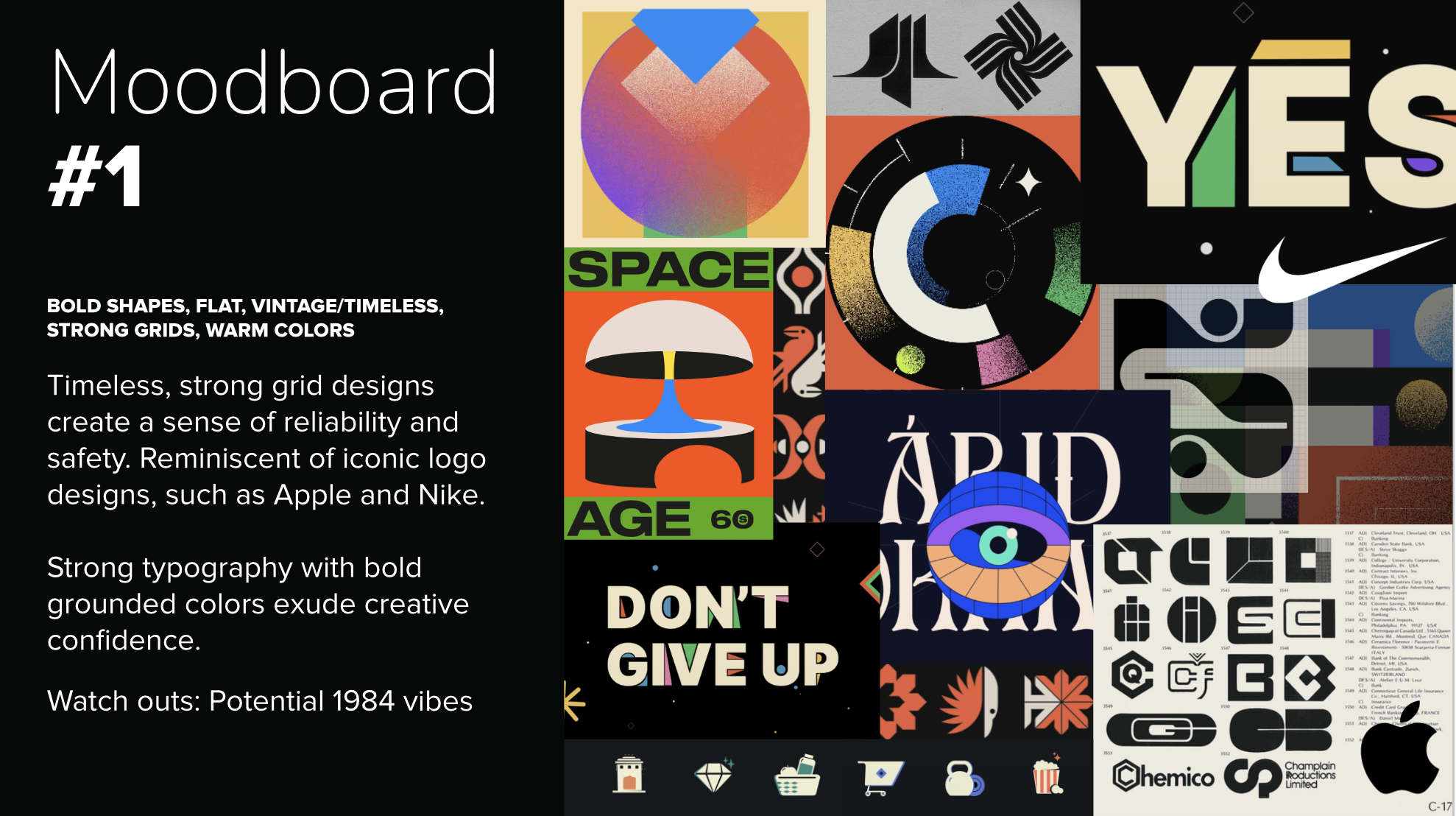
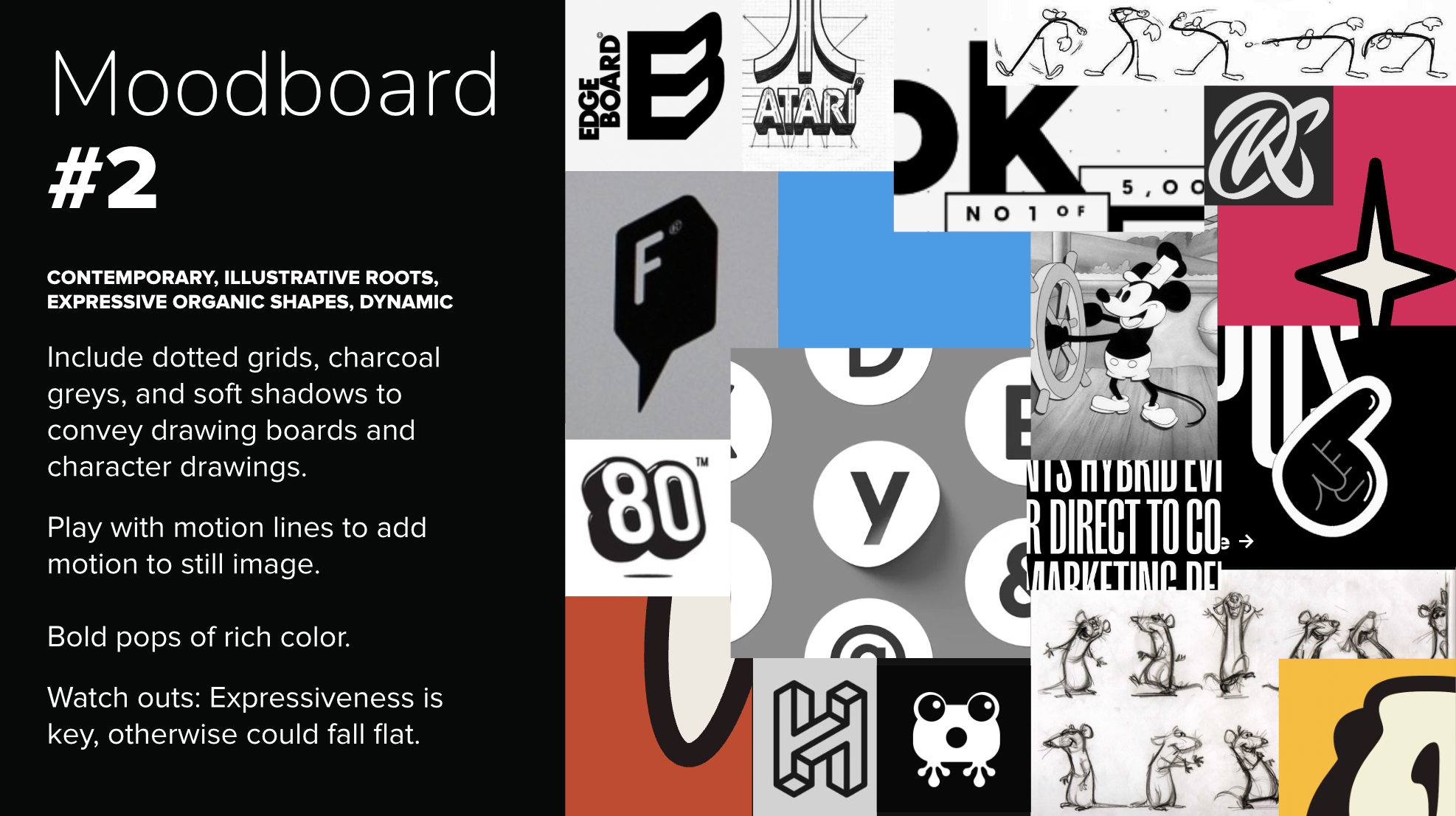
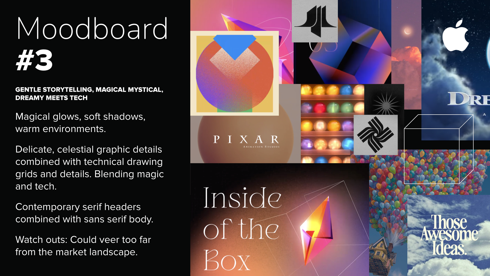
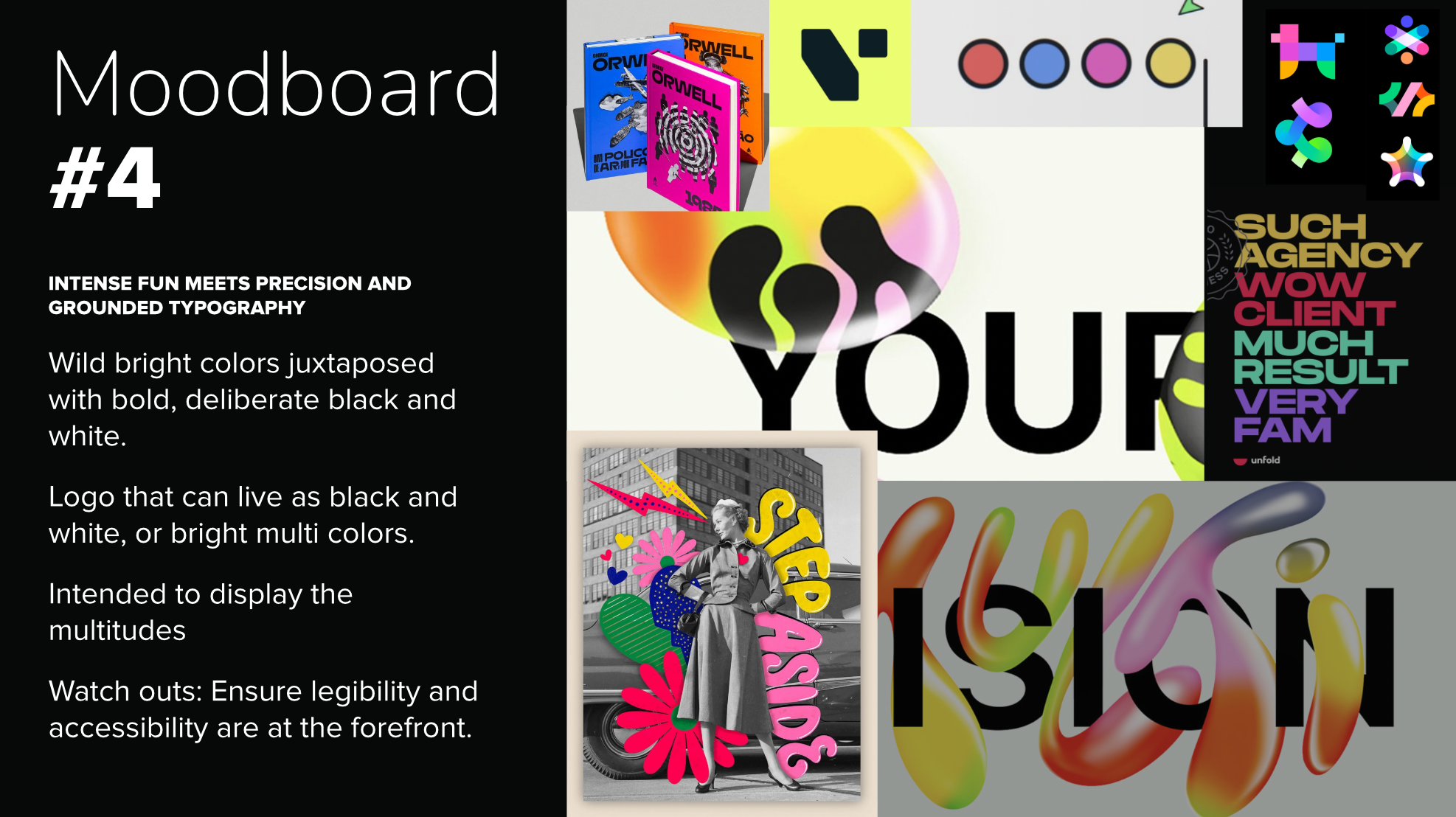
How do you want Portalis AI to be perceived?
While discussing the initial moodboard options, we nailed down exactly how Portalis wanted to be perceived, and picked direction #3 to dive into.
“Trustworthy”
“Innovative”
“Multi-Dimensional”
“Magical”
“Accessible”
“Pixar Meets Tech”
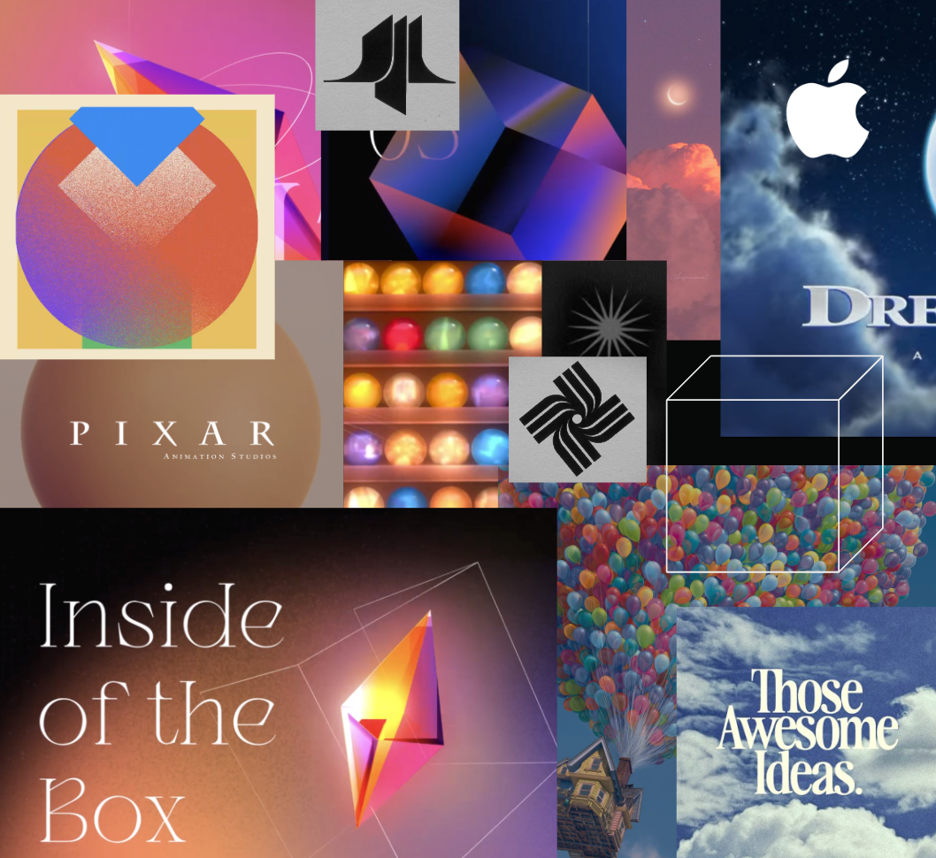
Exploring Logos
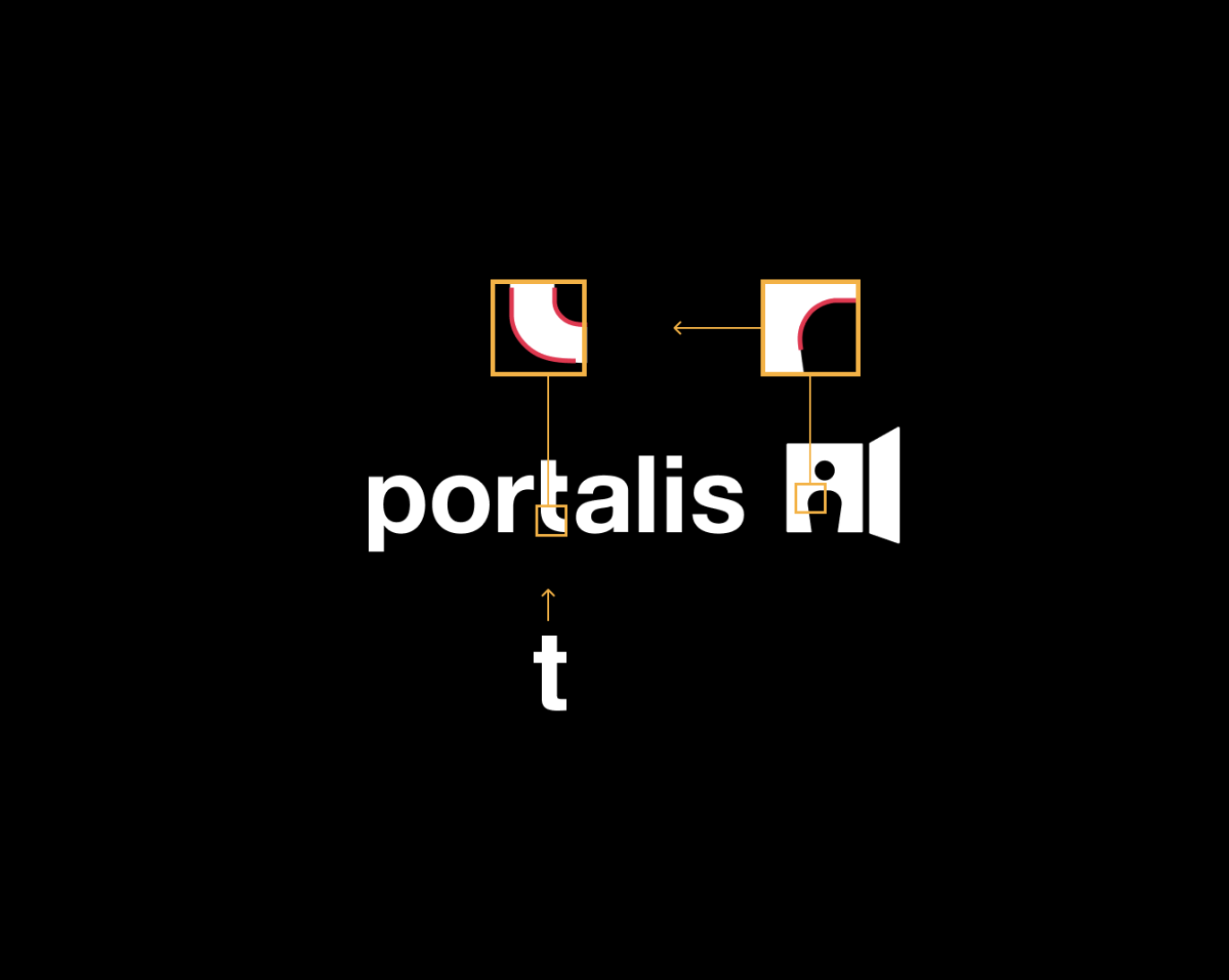
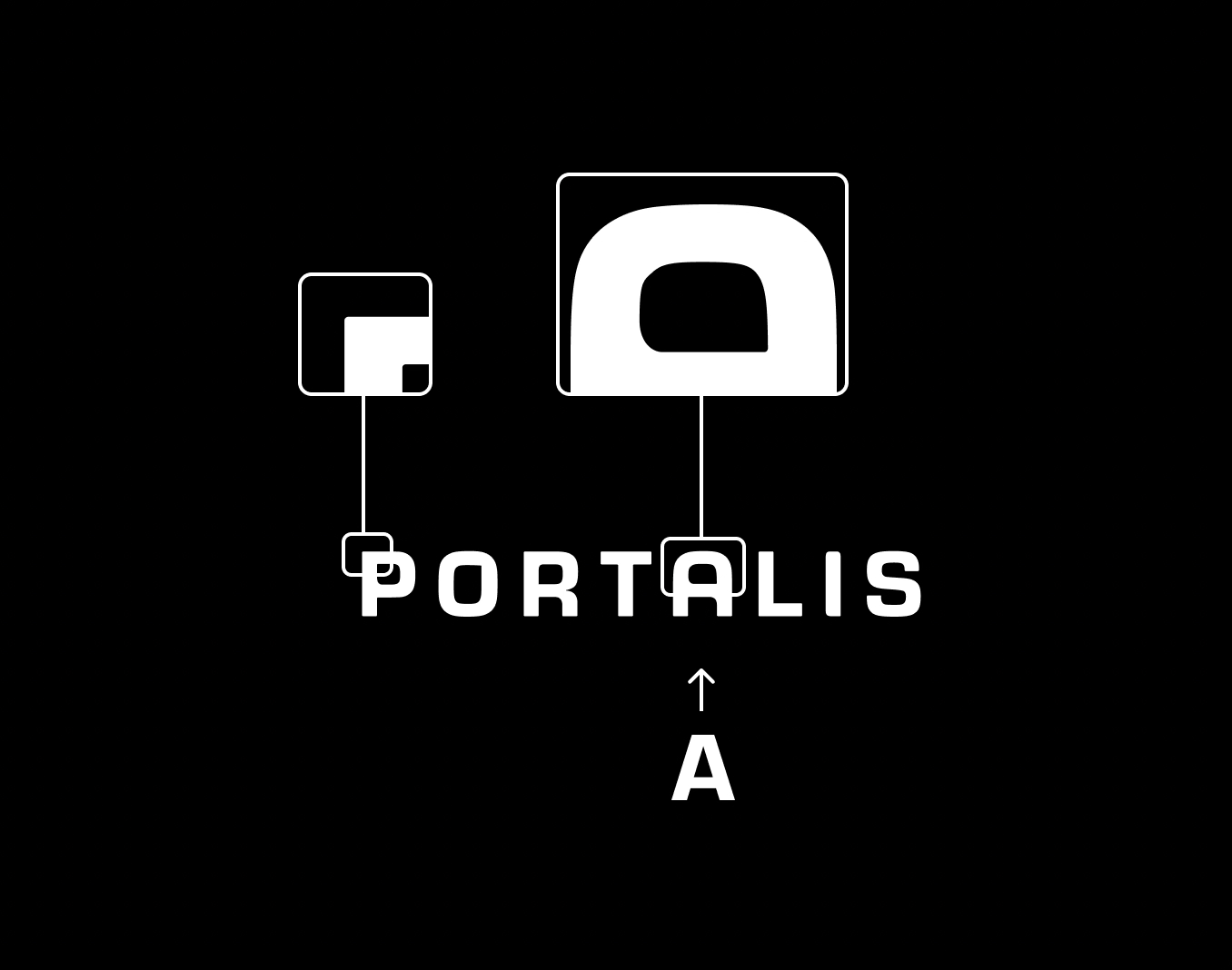
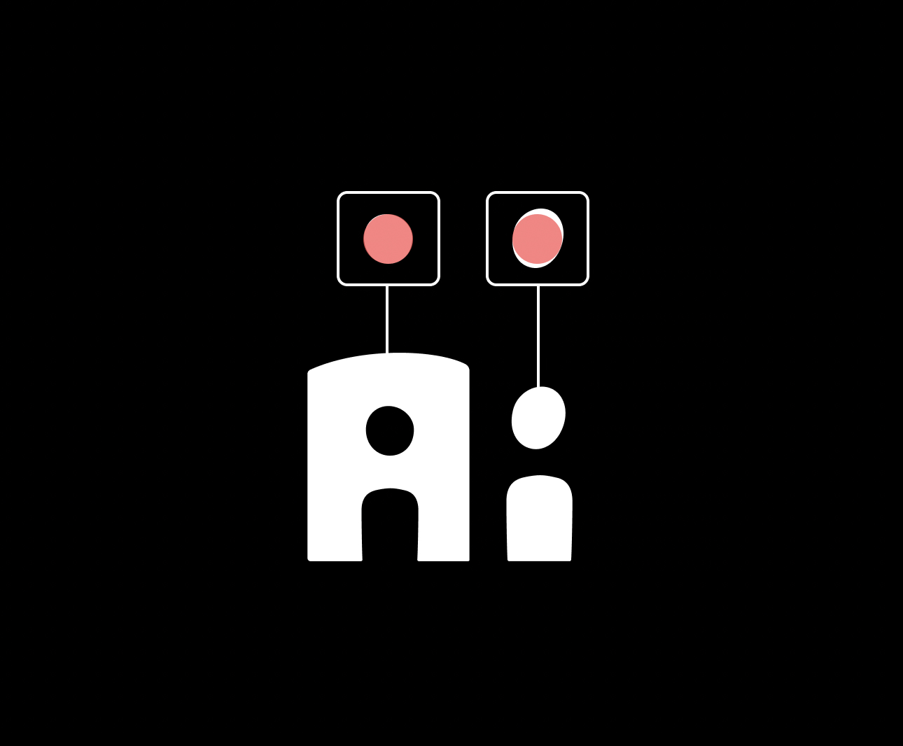
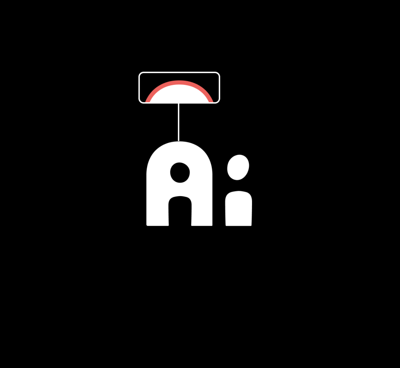
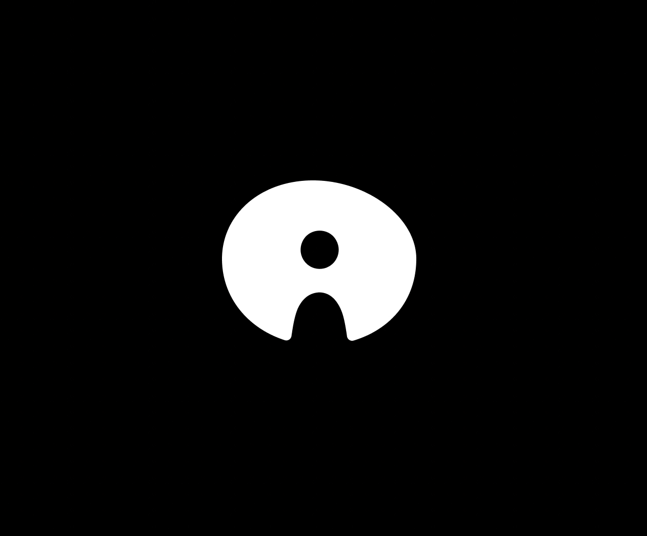
I explored the intersection of “heart” and “technology.” Keeping the logo options clean and digital friendly, while playing with organic shapes. The client really wanted to see different iterations of the “A” and the “I” overlapping to create a silhouette of a person in a doorway. After a few rounds of iterations, the client gravitated towards subtly treated typography, and a version of the icon that felt in balance with the weight of the type.

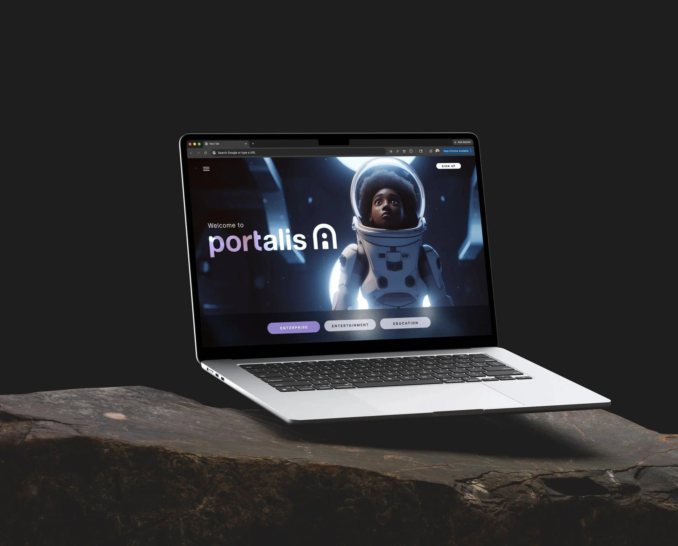
Final Direction
A Creative System
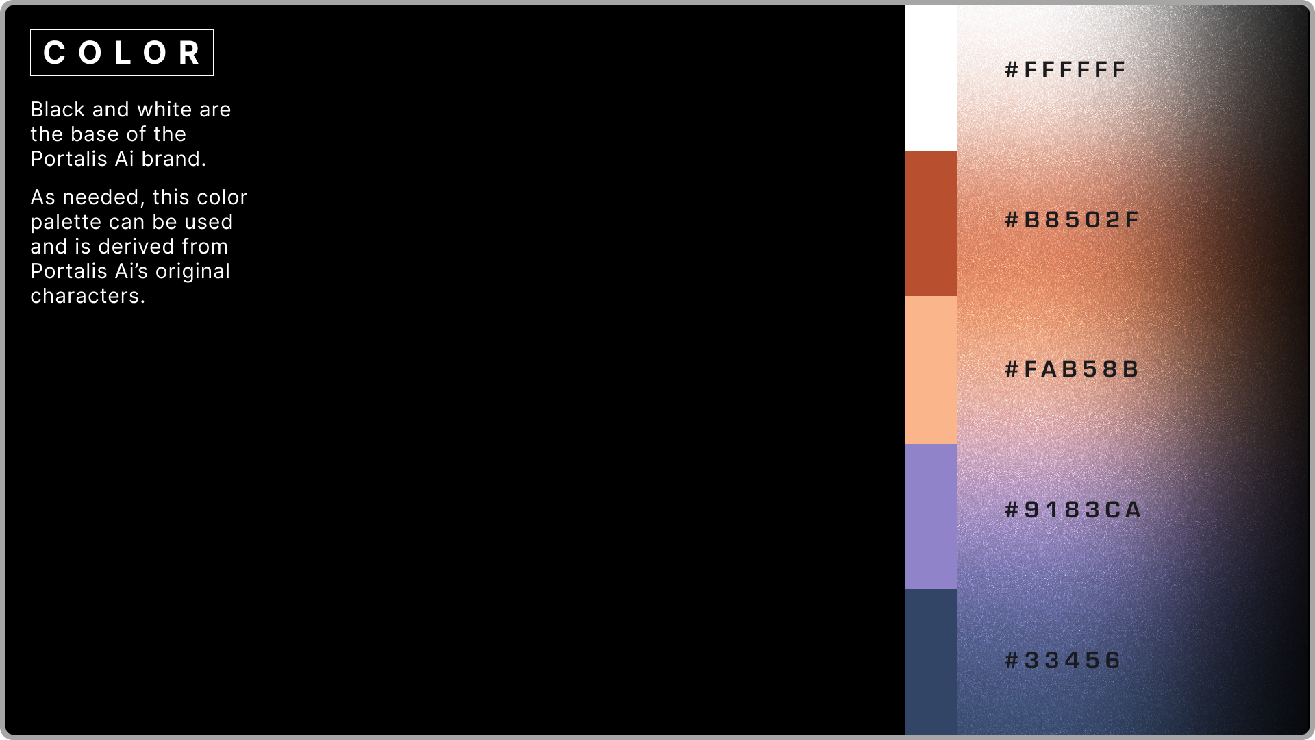
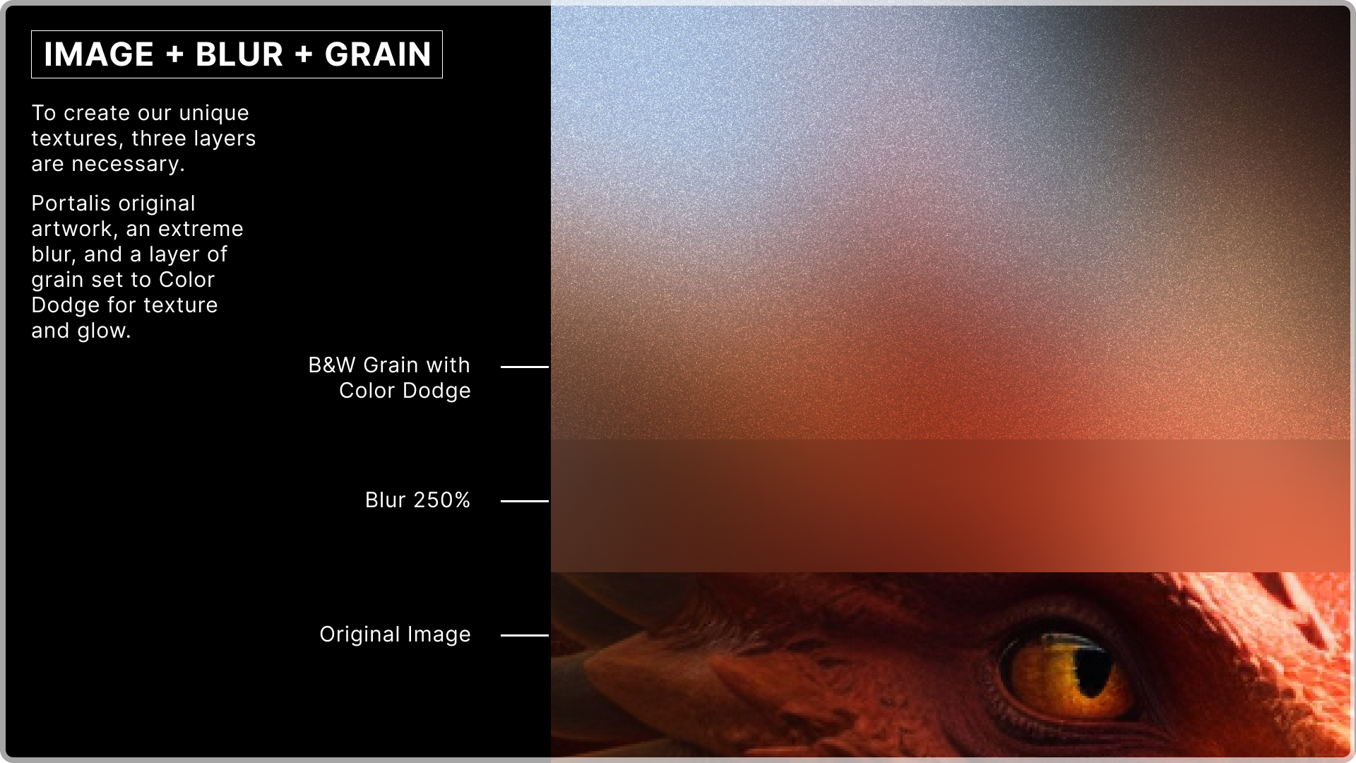
Portalis has some incredibly impressive avatar creation technology. I created a system to work with this library of fantastic characters to grab the warmth and colors directly from the artwork.
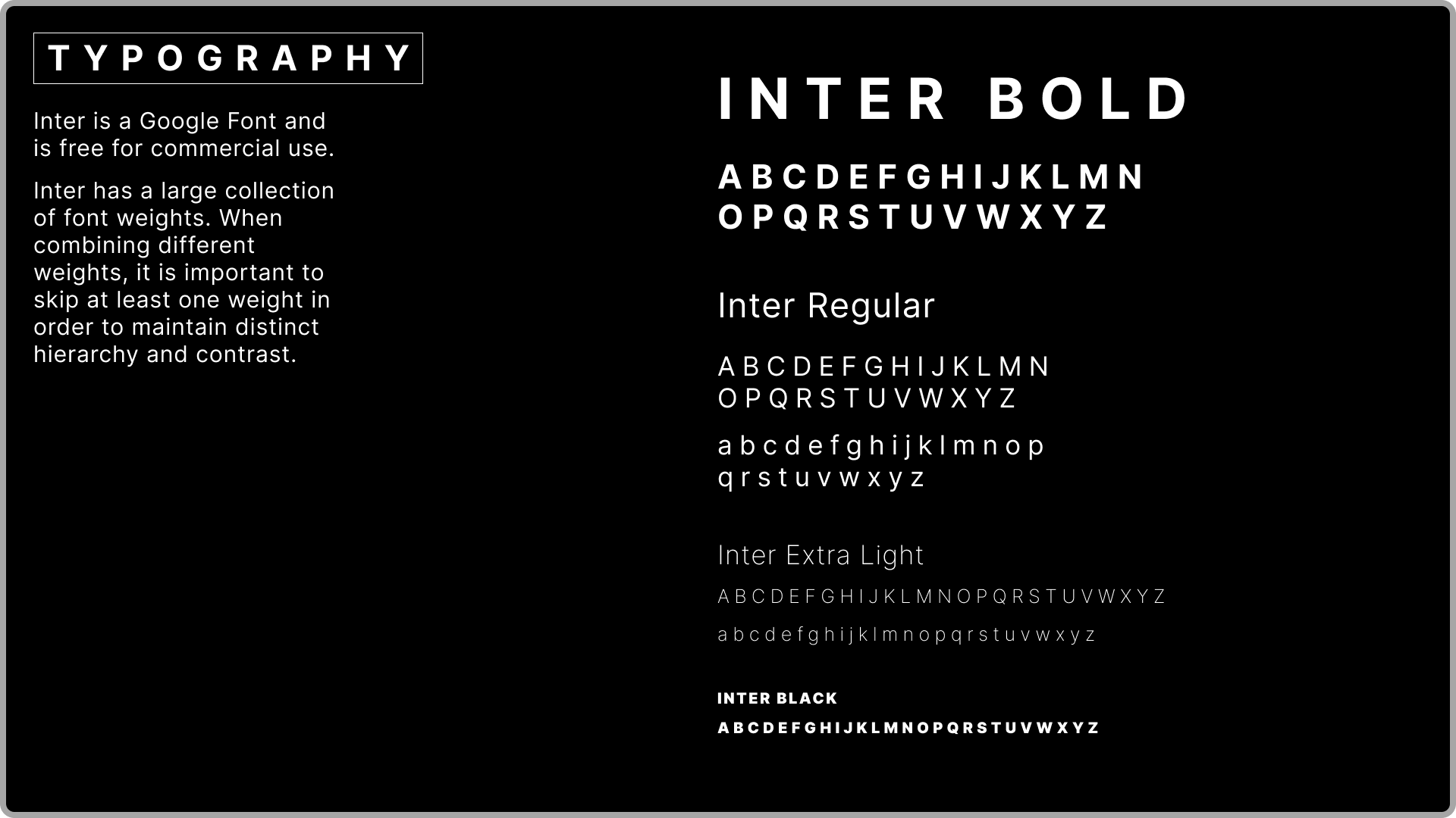
I created an easy-to-use, copy-and-paste Figma template for the team to be able to make more of these rich textured backgrounds as their brand grows. Simultaneously expanding their color palette to be limitlessly flexible.
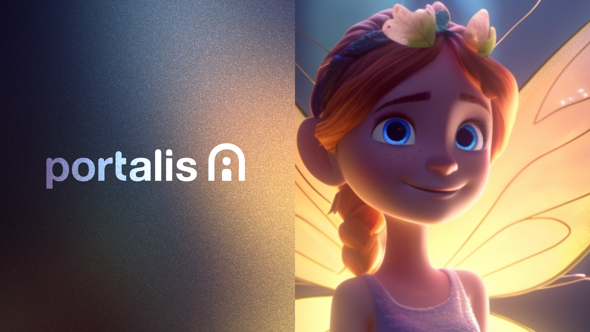
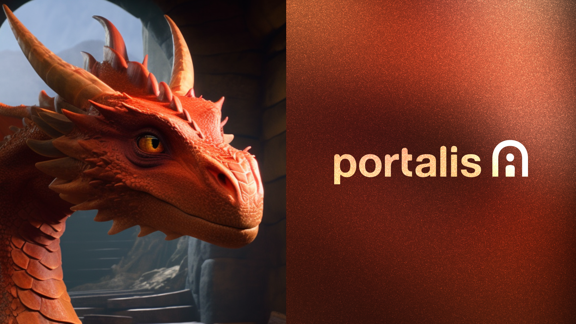
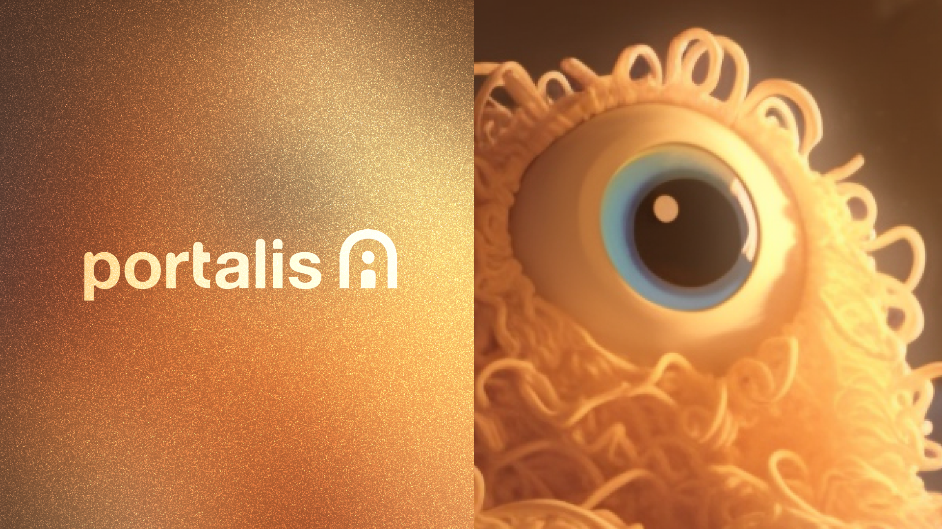
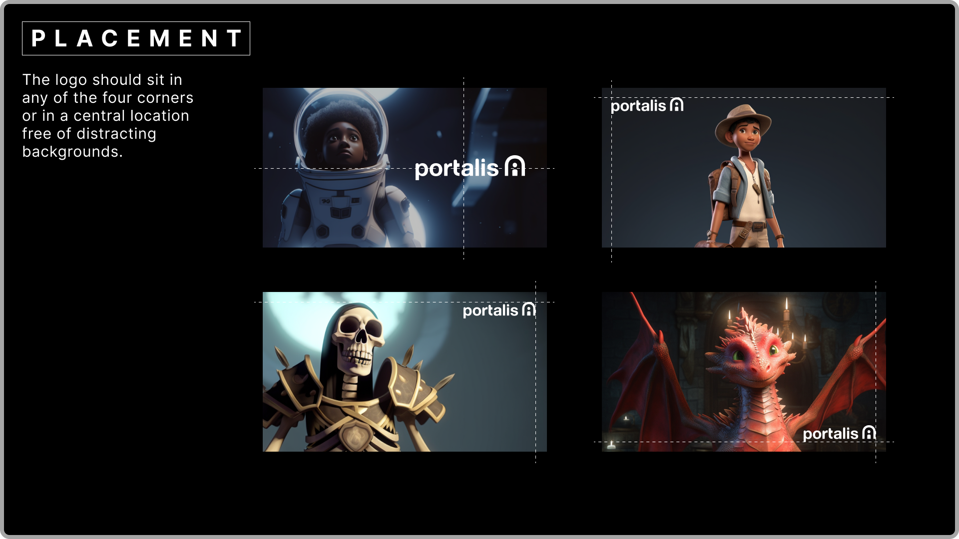
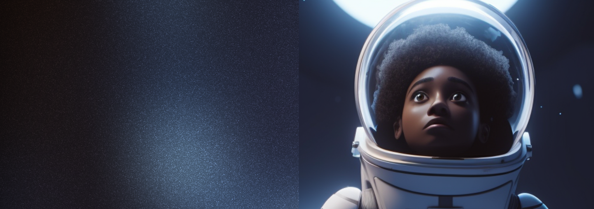
The final system gave Portalis AI something their competitors didn't have — a brand with genuine personality that could flex across every surface without losing its warmth or its edge. One that didn't just sit alongside their characters. It was built around them.